Lizzie
How did you use your own unique ideas in your work?
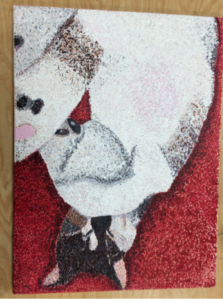
For my work, I used my own ideas with the different colors. I used colors that you didn't necessarily see in the actual image to depict lights and darks. I used light purple and light blue in some parts to show lights and I used dark purple in the areas that would usually be black so the black wouldn't over take the painting. I used red for the back ground to make the image pop.
Did you use an inspiration and combine with your own ideas?
I used the idea of pointillism for my art work and in some parts I actually painted a solid Color and went back over it with different color dots to make sure the brown wouldn't show through in some parts. Like the pink in the stomach I painted fully pink and went back with white and light gray dots.
Did you learn new techniques?
I feel like I say this a lot but I always learn different colors you can use for the lights and darks. It's so fun using colors that aren't in the picture to depict the different values. It's also fun pairing complimentary colors together and seeing how well they look together when you are done. I was nervous using blue and purple but I think they turned out so well.
 RSS Feed
