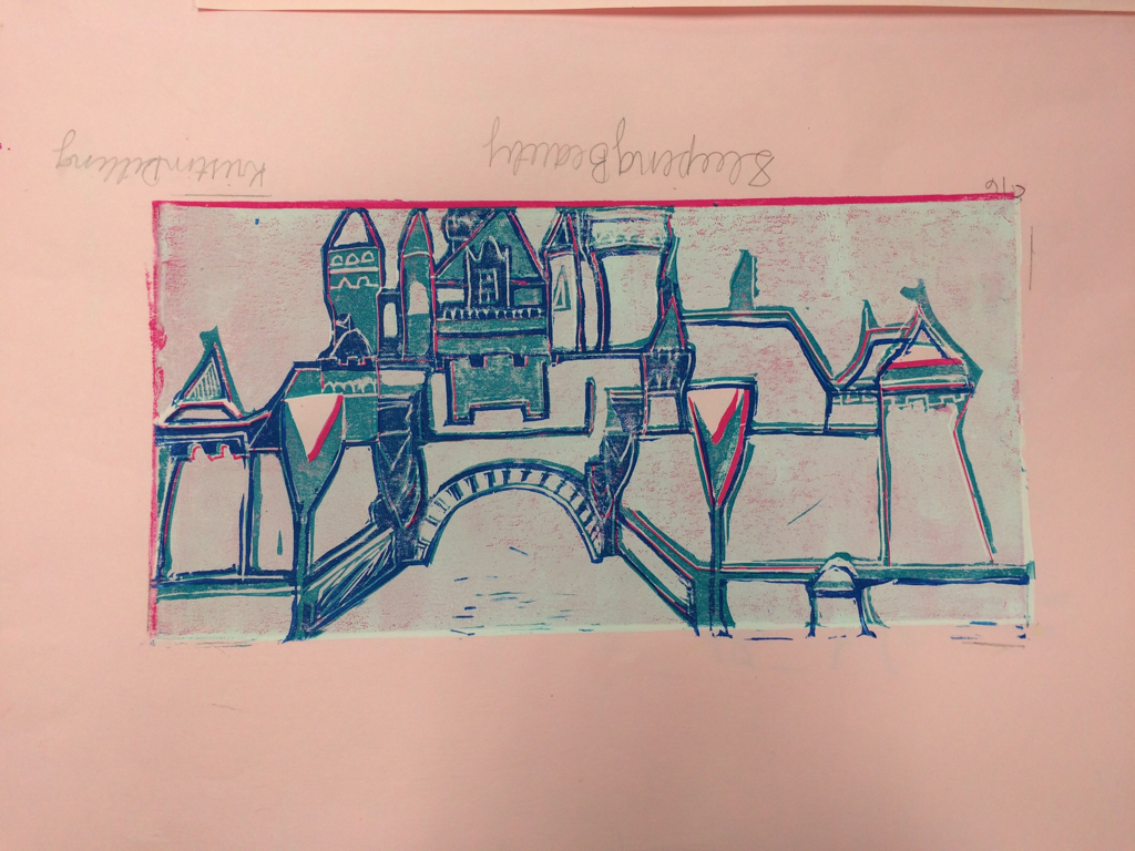
I chose to do the sleeping beauty castle for print making. You can seen the side walk, the entrance, and most of the front of the castle. I used white, pink, light blue, navy, and turquoise in this print. The entrance stands out to me because of all of the pop of turquoise that you see. The mood of this work is probably peace. For me, anyways, because I love Disney and I love these colors so when I look at this I just peaceful and happy. If someone else looks at this, they might think that happy is the theme because of the colors and seeing the place it is. I was so excited that Ms. Rossi let me do the castle for this project. I think the colors and the lines look pretty good but I wish I would've lined up the prints better each time I printed. It was really hard to get tiny lines carved into the linoleum and to keep the paint out of the lines when I was paint on it. It was also hard to line up the prints without smudging or getting finger prints on it. I over all didn't really like this project. I thought it was frustrating. I liked carving it but the lines and lining it up was not fun.
 RSS Feed
